
Bookbinding
In 2019 I undertook a year long bookbinding course at Hot Bed Press, Salford. I set a challenge that for every book we would make in the class I would then go on to make a new book with artwork that wasn’t photography..
This differs from other Sessions in the sense that it has taken longer than a weekend to created this series. However, each book has taken around a weekend to plan, create and make.
.

sushi for readers
As part of the course we were asked to create an editioned book that we could then swap with everyone else on the course. A great way to start up your own artists book collection and to work with editions.
Part of the resources available to us to create books were some sushi stickers which I decided to use given that I can’t draw and I wanted to do something different to photography with text.
Each section of the book relates to a book and an author. The text on each page gives clues to the book, whilst also referencing sections of the book and the style of the writer. For example, ‘Sushi Recognition’ is a play on ‘Pattern Recognition’ by William Gibson, whose main character is Cayce Pollard has an allergic reaction to brands, this is played out in the text by the references to ‘Coca-Cola’ and ‘Yo! Sushi’. The sushi images tie in with what is being described in the text or reinforce images from the original book.
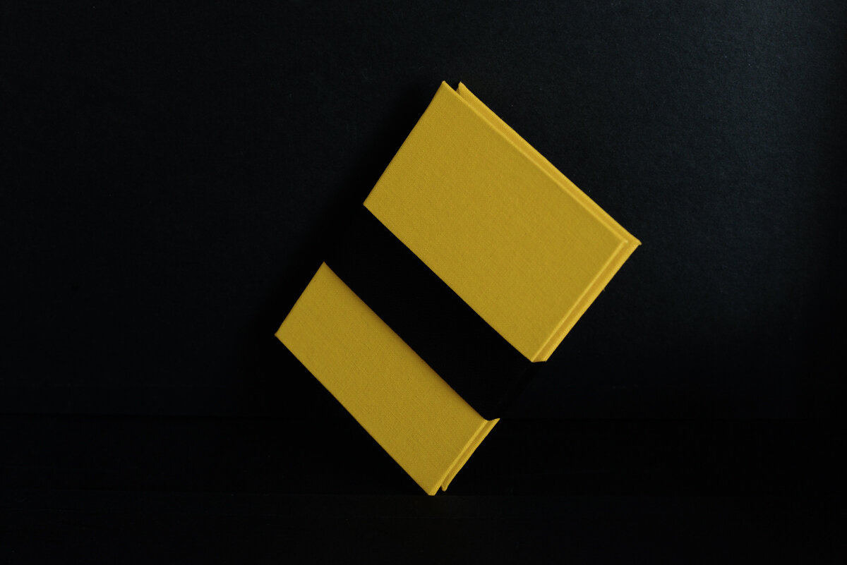
The cover design references Tomago Sushi, a yellow cover for the egg, white paper as the rice and a textured black band for the Nori seaweed. This is a concertina book.

Conversations in colour
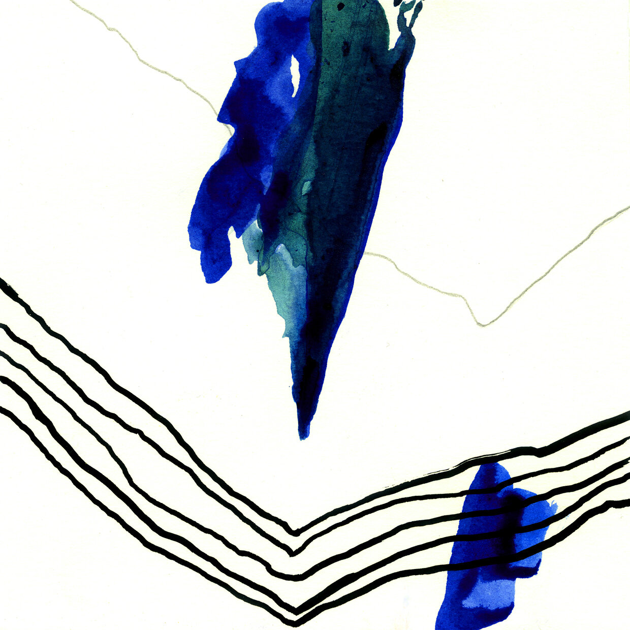
I used to enjoy working with ink when I was an art student but I haven’t done anything with it for years. The design of this book seemed to lend itself to this medium.
In my photography I work predominantly in black and white, this is mainly due to the fact that I don’t understand what an image means when its in colour. It was quite freeing to work in inks again and to bring colour into the mix, it began to feel like a conversation with colours, with my trying to understand what its doing and how it reacts with other inks, the paper, pencil, pen etc.
The lettering was done with letterpress, this was something else that we learned how to do on the course, and it was a great way to get the title onto the cover in gold since foil blocking wasn’t available.
This is a waterbomb book.


Room for dessert?
During the break on the course we would take it in turns to bring in biscuits and cakes. I love to bake so I would bring in something home baked. I have a penchant for desserts, its my favourite thing to make, so the opportunity to share with a big group meant that I could bake some of the cakes or biscuits that I might not have done for just the two of us. This turned into a joke about being on the Great British Bake Off. I decided that one of the books I created should be focused on cakes or desserts.
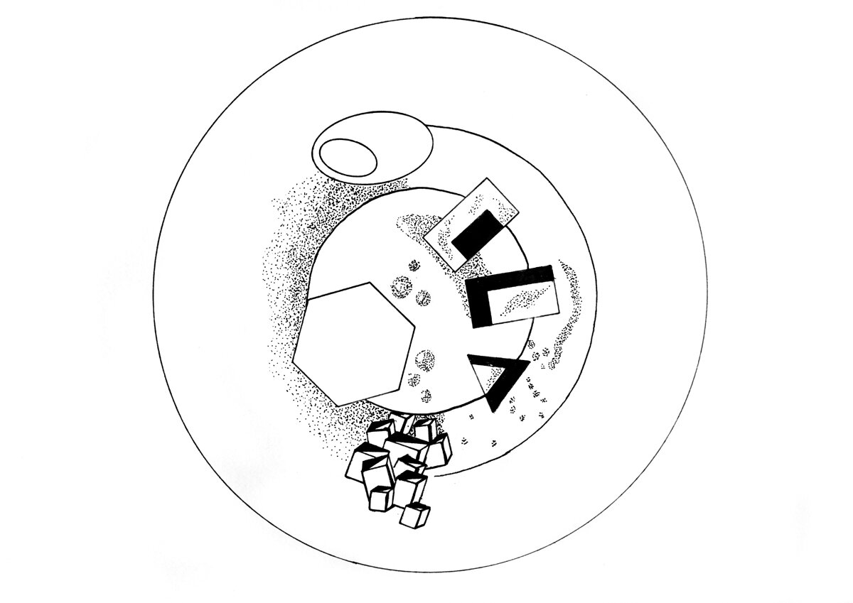
I can’t draw, but I do work for an engineering company that uses stencils in order to make their drawings. I decided to use these to make the images. I’d recently watched a program about Will Goldfarb who set up a restaurant that solely makes desserts. These plates are drawings of his desserts.
This is a Japanese stab stitch book. Printed on parchmentized paper.


Mountains on my mind
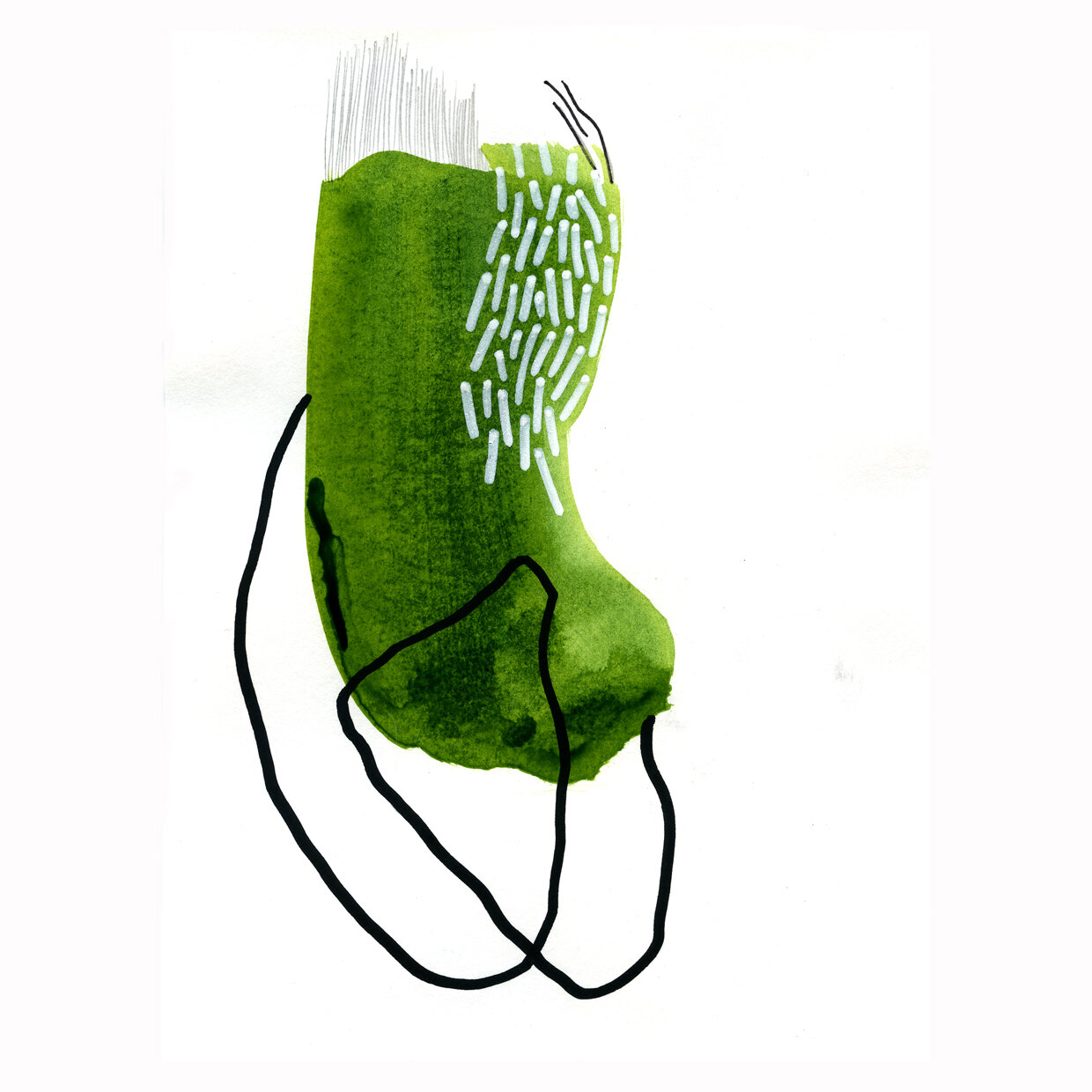
During one of the early sessions at HBP we were encouraged to create an instant book and fill the pages. I’m not very good at drawing, however, I had been doing some embroidery at home that relied on making line drawings to create images of mountains and fields. I started to draw such an image during the session, after I decided to try and free up the drawing style as that seemed to suit the medium of ink.
I’m a keen walker and the couple of pieces of texts refer to well known sayings and some of things I’ve pondered whilst out on walks, such as ‘There are many paths up the mountains but the view at the top is the same’, and ‘A day in the mountains lasts for an eternity’.
This is an instant book printed on GF Smith colour plan paper.


